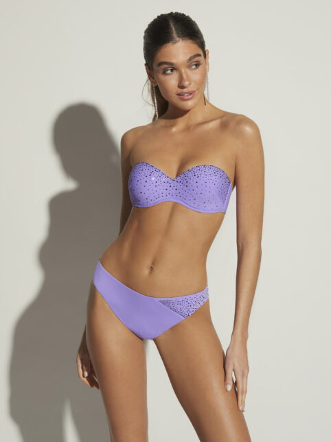
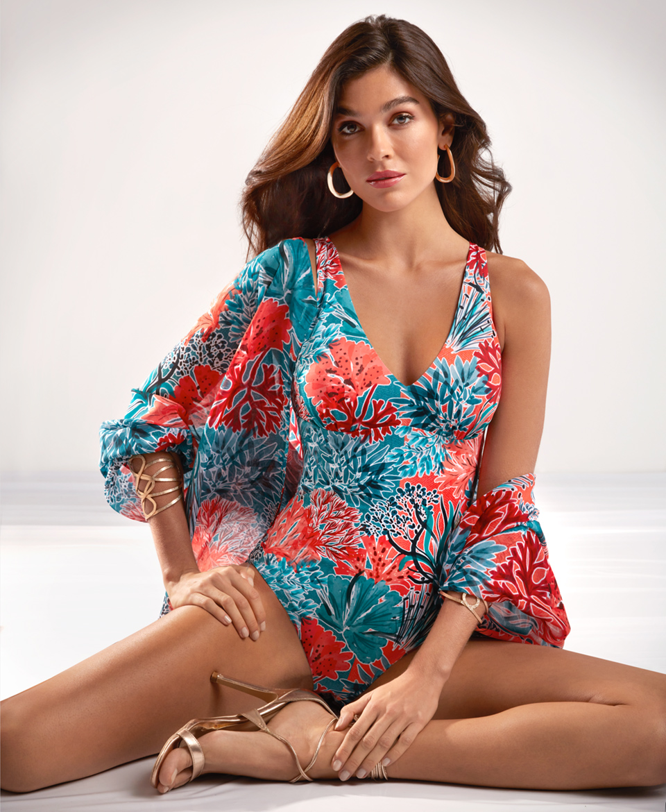
Colour of the season we’ll be wearing the most

Date
March, 11th 2025
Author
Roidal
Tags
Fashion is a reflection of our personality and mood, and each season brings the opportunity to reinvent ourselves through the colours we choose.
At Roidal, we understand the importance of staying ahead of trends, which is why we invite you to discover the colour of the season that will dominate beaches and pools this year.
How to wear the colour of the season at the beach and pool
Incorporating the colour of the season into your swimwear is easier than you think. Here’s how:
- Swimsuits and bikinis: Choose pieces in vibrant shades like turquoise blue or emerald green, which evoke the freshness of the sea and enhance your tan.
- Accessories: Add elements like sarongs for women, hats, or beach cover-ups in contrasting colours to create a balanced and stylish look.
- Prints: Geometric and floral designs in all season colors bring dynamism and style to your beach outfit.
The colours that will be trending this season
This year, the colours of the season range from energetic and sophisticated tones to timeless classics. Here’s a look at the must-have shades and how Roidal incorporates them into its collection so you can find your perfect swimsuit or bikini.
Citrus tones that bring energy and freshness
Citrus shades like vibrant orange and acid yellow are perfect for reflecting the sunlight and adding vitality to your look. At Roidal, these colours are paired with flattering cuts and elegant prints that enhance your tan and radiate freshness.
Klein blue bringing the power of the sea
Klein blue remains a favourite in swimwear fashion. Its intensity and depth make it the perfect choice for a sophisticated and modern look. At Roidal, you’ll find it in swimsuits with sculpting cuts that flatter the silhouette and add character.
Intense red evoking boldness and femininity
Intense red is a must-have for those seeking a bold and feminine look. This colour suits all skin tones, and in Roidal’s bikini collection, it is combined with elegant details that add a touch of distinction.
Pure white for minimalist elegance
White remains a symbol of freshness and sophistication in swimwear. Perfect for enhancing your tan, Roidal reinterprets this timeless hue in sleek designs and high-quality fabrics that ensure a flawless fit.
Classic black, timeless fashion
Black never goes out of style. It is the go-to colour for a slimming effect and exudes understated luxury. At Roidal, it is featured in women’s bikinis and swimsuits with sculpting cuts and haute couture details that set them apart.
Navy blue, the refined classic
Navy blue is another timeless shade that never disappoints. In Roidal’s women’s swimsuits and bikinis, it is reinvented with details such as draping and subtle prints that bring dynamism.

The craftsmanship behind colour in fabrics
At Roidal, each piece is the result of a meticulous artisan process. Our high-quality fabrics ensure durability and comfort while allowing excellent colour reproduction, ensuring that every swimsuit and bikini looks vibrant and striking.
Additionally, we use advanced printing techniques to create exclusive patterns that reflect the latest trends, offering unique pieces that blend fashion with functionality.
In short, the colour of the season is an invitation to experiment and express your personal style. At Roidal, we offer a wide range of options so you can find the perfect piece to suit your taste and enhance your natural beauty.


