Take a look at the colours we’ll be wearing…
Date
July, 13th 2021
Author
admin
Tags
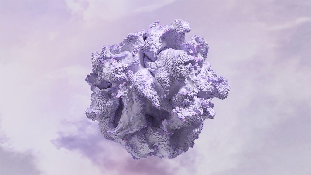
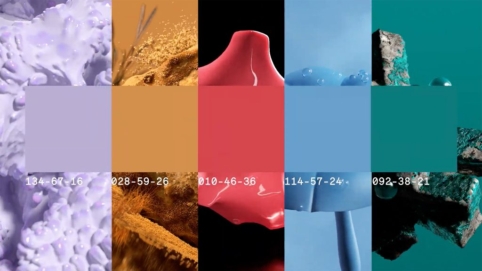
Driven by optimism and a penchant for the natural, Digital Lavender is set to be the colour of the year in 2023 according to trend forecasting agency WGSN and colour authority, Coloro.
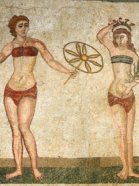
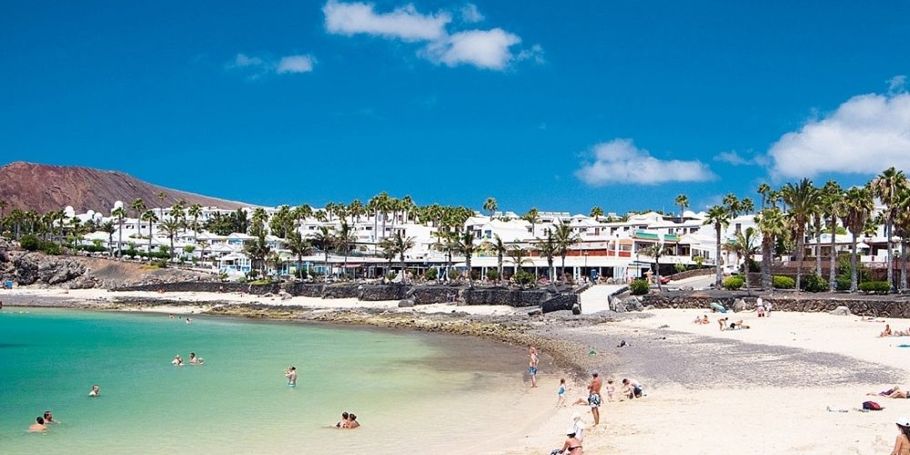
While many of you are counting down the hours until you can escape to the beaches and pools and enjoy the summer in your swimsuits and bikinis, at Roidal we keep thinking about you and the next collection with which we want to surprise you and which, as every year, will be spectacular.
So, and anticipating trends, or trying to follow them, in this post we analyse the colours that will come in fashion in the year 2023, and it is now when the professionals of fashion design and clothing have to stock up on fabrics and choose prints to be able to faithfully attend each fashion appointment.
Thus, according to the renowned trend forecasting agency WGSN and Coloro, an institution in colour terms, they predict that “Digital Lavender” will be the colour of the year, supported by the need for widespread optimism that is sweeping the world in the wake of the global pandemic we are experiencing.
Digital lavender represents “the stability, serenity and digital escapism that many of us have incorporated into our recovery rituals to protect and improve our mental health in difficult times,” say Coloro. In this sense, the colour palette for the coming years reflects a more hopeful and optimistic view of the future, although consumers will tend to look for colours that they can relate to positively.
The meaning of purple symbolises magic, mystery, spirituality, subconscious, creativity, dignity, royalty and evokes all these meanings more than any other shade. In addition to this colour, the colour report also includes other shades within its trends and notes that organic shades will take advantage of the growing interest in nature and the countryside, with natural tones, while they claim that saturated and stimulating colours will return, driven by the yearning for positivity and the growing influence of virtual worlds, where new forms of self-expression flourish.
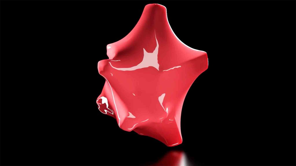
Thus, “Luscious Red” heralds the return of stimulating. Red is a powerful colour that can elevate the heart rate and tap into themes of desire, passion and empowerment, and this particular shade has a lightness and translucency that also feels immersive and hyper-real, making it perfect for both physical and digital products and experiences.
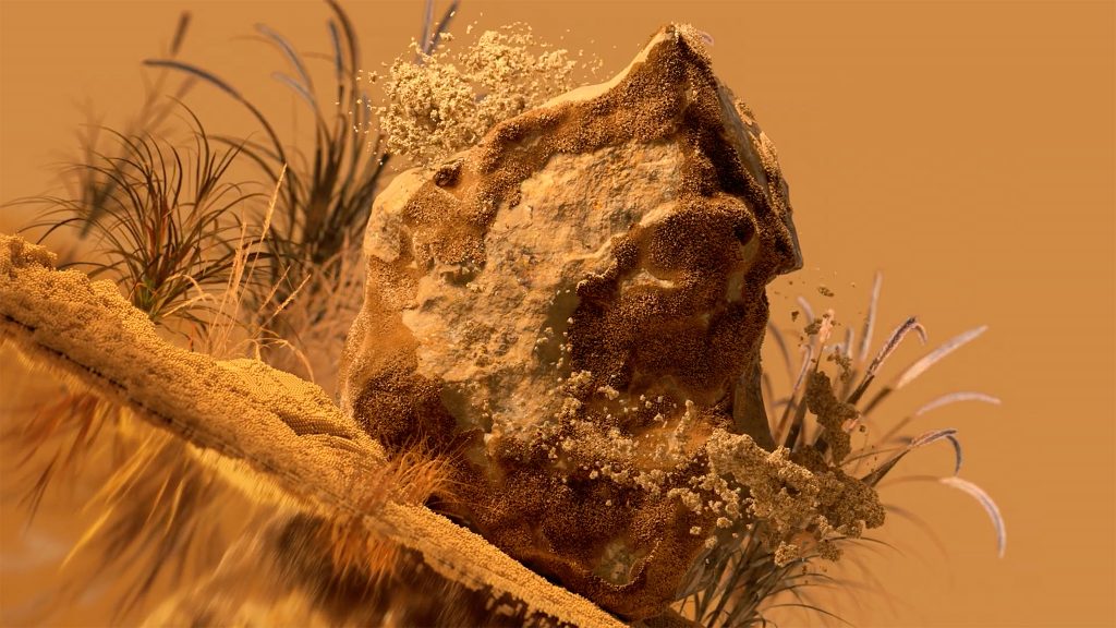
Meanwhile, the colour ‘Sundial’ highlights the importance of organic and naturally sourced colours as consumers reconnect with the countryside and nature. With the growing interest in craftsmanship, community, sustainability and more balanced lifestyles, earthy yellows such as these will resonate more strongly. This healthy ochre yellow can also be sourced naturally from food waste, plants and minerals, connecting with the movement of slow life.
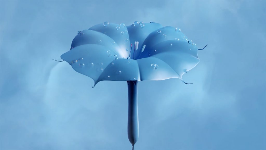
The colour “Tranquil Blue” highlights blues, particularly bright mid-tones, and connects with sustainable values, and has a lightness and clarity reminiscent of the elements of air and water. It represents stillness and tranquillity, which consumers will look for to counteract overwhelming emotions.
Already emerging in the high-end womenswear market, this colour will resonate across all fashion categories as a contemporary update of mid-century blue. As a medium saturated shade, it can be applied in large proportions to make a bold statement but can also be softer when combined with pastel or neutral base tones.
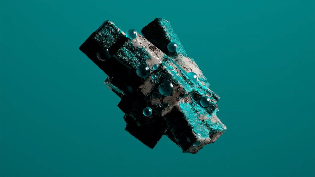
Finally, “Verdigris” is a saturated colour that takes its name from the greenish pigment that forms in oxidised copper. It lies between green and blue and signals a shift towards invigorating digitised shades. This colour is imbued with nostalgia, recalling the sports and outdoor wear of the years.

